YaleSites Themes
YaleSites Themes allow you to create a website with little technical or design expertise required while maintaining a look and feel that is consistent with Yale’s design standards. YaleSites Themes get you started with a design based on Yale web guidelines and a set of “out-of-the-box” features and tools like a news listing, photo galleries, social media capabilities and built-in mobile optimization.
YaleSites 2016 Themes
In January of 2016, the Yale institutional website (http://yale.edu) was redesigned. To meet the need for department and organization sites to have a similar look and feel, the ITS YaleSites team, in partnership with the Office of Public Affairs and Communications, developed YaleSites 2016 Themes. As of June 2016, all new sites will be created with YaleSites 2016 Themes and existing sites are encouraged to change to the 2016 version to maintain consistent look or “brand” across campus.
In January of 2018, Yale’s Web Accessibility Policy was adopted. Moving to the YaleSites 2016 theme will make it more mobile friendly, and will improve the accessibility of the site.
If you are interested in the 2016 Themes for your existing site, please request a refresh of your site (Request a Refresh Form) and check both Move my site from development to production and Add 2016 themes on my site.
After you’ve received notification that your request is complete, it’s important to start by updating the theme on your development site: dev.sitename.yale.edu.
- Enable the Yale 2016 Themes module before changing the theme itself.
- Then go to Appearance to enable the new YaleSites 2016 theme.
- Check your development site against production to see if any content displays have been altered.
- If all looks well on your production site, submit a go-live request at yalesites.yale.edu/go-live-request.
- If you need further assistance, send a request to yalesites@yale.edu.
YaleSites 2016 Theme Options
The 2016 Theme options are the same as the originals: Standard, Boxed and Wide. You will find color choices, fonts and features not available in the original YaleSites Themes. As with the original version, you can easily switch from one to another, as well as customize your site’s accent colors and sidebar heading styles.
|
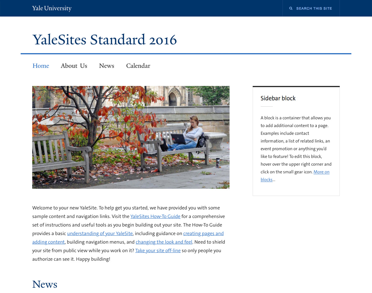
Standard 2016
 |
Wide 2016
 |
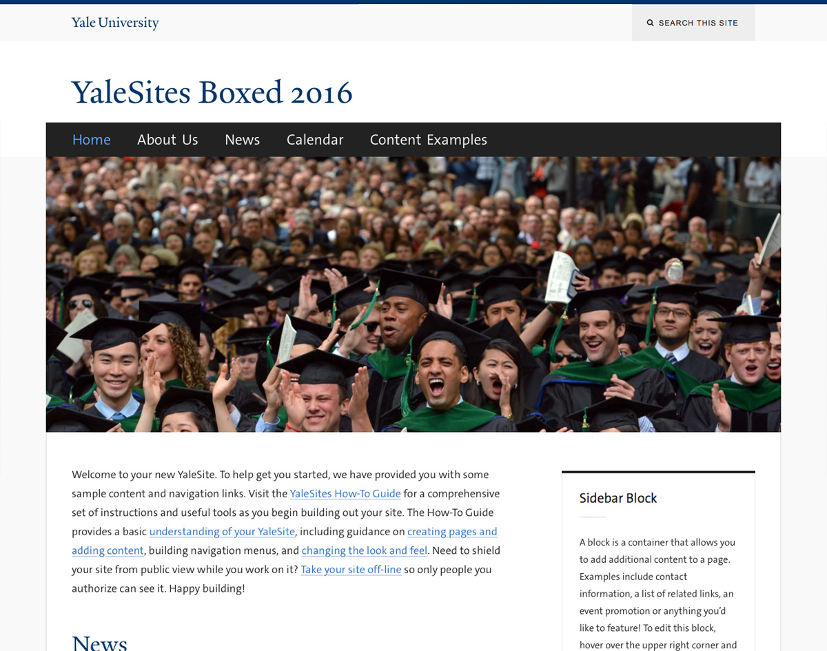
Boxed 2016
 |
Moving to YaleSites 2016 Theme Checklist
This checklist provides additional instructions for people who are switching from the original YaleSites Themes to the 2016 themes. This transition will be easier if your site is using the original YaleSites Themes and have made minimal changes with CSS injector. Sites with Custom themes will require additional rework based on the level of complexity.
- Select Theme – Enable the Yale 2016 Themes module before changing the theme itself. Then go to Appearance to enable the new YaleSites 2016 theme.
- Configure Design Options – The Design Options Page has changed to only list the 2016 Themes. Choose the theme and accent colors based on your preferences. More about design options.
- Adjust preconfigured styles and settings – Turn off all CSS Injector rules and adjust menu settings (some default pages will show up on menu).
- Adjust Thumbnail Image Sizes – Thumbnail images sizes have changed for the 2016 themes. The defaults must be overridden for all thumbnails to eliminate and prevent fuzzy, distorted images. More about adjusting thumbnail images.
- YaleSites 2016 Theme Regions – The Preface and Postscript Regions are now exposed and available on every page. These Regions have specific purposes and should follow some simple guidelines to assure the integrity of the Theme design is maintained. More about theme regions.
- Secondary Menu – The Secondary Menu replaces the Banner menu and is displayed in the Topper Second Region. More about the secondary menu.
- Correct Use of Sidebars – Some changes to the sidebars might require some adjustments on sites using the current YaleSites Themes. Sidebar First (left) should be the only be used to display submenus (Menu Block). All other Blocks should be added to the Sidebar Second (right). More about sidebars.
- Block Styles – In addition to the Accent colors chosen from the Design Options page, you can add classes to Blocks to remove the accent color or change it based on your site needs. More about block styles.
- New Text Styles – Table styles, Block Quote, Citation, Drop Cap have been added to help enhance and customize the look of your site. More about text styles.
Configure Design Options
Once you have chosen your theme, you can modify your design by changing accent colors and font styles for headers. These changes are made on the Design Options page, below the Theme selection.
- Go to Appearance > Design Options
- Navigation accent color: Change the accent color of the main navigation.
Navigation Color Carbon 
Blue Medium 
Yale Blue 
Orange 
Green 
- Navigation heading font: Select one of the font options for the typeface of the Main Menu
Navigation Style 
Serif 
Sans-Serif 
Condensed - Sidebar heading font: Change the font of sidebar headings
Style Sidebar Heading Serif 
Sans-Serif 
Condensed 
- Sidebar accent color: Change the border color of sidebar block headings
Color Sidebar Carbon 
Blue Medium 
Yale Blue 
Orange 
Green 
- Sidebar style: Choose between outline and shaded background
Adjust Thumbnail Images
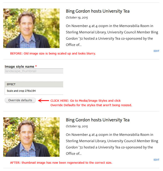
If you are transitioning your site from the original YaleSites Themes, the thumbnail images carried over from older YaleSites may need to be regenerated in order to have the correct size for the new 2016 themes. Thumbnail images may appear too small or they may be blurry by being stretched up in size.
Optimum Image Sizes: In the News Content Type your image can be up to 500px wide, which is the optimal size for the News pages. Your image will be sized down to 276px wide for the News teaser lists.
Adjust Thumbnail Images
- Go to Configuration > Media >Image Styles and edit the image style that’s being used. For News, the image style is “landscape_thumbnail”.
- Click on the Override Defaults button. That’s all you need to do, don’t change anything.
Choose a YaleSites 2016 Theme
You can easily switch to another design template as well as customize your site’s accent colors and sidebar heading styles.
- Click on Appearance > Design Options in the Administrator Toolbar.
- Select the desired YaleSites 2016 Theme you want (YaleSites Standard 2016* is selected by default).
|
Standard 2016
|
Wide 2016
|
Boxed 2016
|
Things to Look for if You Are Switching to the YaleSites 2016 Themes
- CSS Adjustments - disable all CSS that you have added with your previous theme.
- Random Blocks - Preface and Postscript Regions are now available with the 2016 themes. You might find some Blocks displaying because they had been placed in these Regions but were not available.
YaleSites 2016 Theme Regions
Regions are sections of your page where additional content can be added using Blocks. Regions vary based on the theme and should be a major consideration when choosing a Theme.
The image below outlines the exposed Regions that are part of the Omega 3 Theme, the foundation for YaleSites Themes. The Preface and PostScript regions are exposed for the 2016 Themes by default, but they don’t have to be used. However, having these Regions exposed allows you to provide additional layouts for various page without having the complexity of using Deltas. (click to enlarge image).
The following diagram outlines the basic Regions for the YaleSites 2016 Standard Theme.

Using the Preface and PostScript Regions
The Preface and PostScript regions are now available for the 2016 Themes by default, allowing you to provide additional layouts for various pages without the need to create Deltas. The Preface and PostScript Regions provide additional areas within your page above and below the Content Region.
Use Editorial Discretion
These Regions are meant to be extensions of the Content area, that leads to more information elsewhere on the site. Be careful not to display too much in these Regions. While any Block can be added to these Regions, we recommend the following guidelines when determining the types of content that should be used. The Office of Cooperative Research demonstrates good use of each of these Regions.
Preface Regions
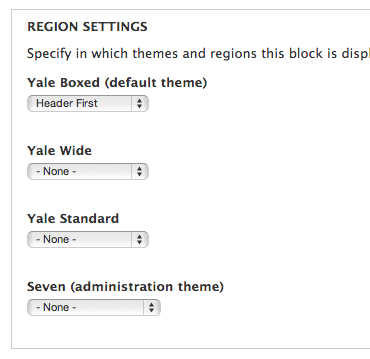
Preface Regions should be used for introductory text or images that lead to more information within the site. You can create custom Blocks with an image that links to another page within the site. Be sure to assign the specific page and region when configuring the block.
PostScript Regions
The PostScript Regions is available at the bottom of the pages and provides 3-4 separate Regions where you can add featured content. Featured news, people, videos, etc. work very well in these regions. There are some pre-built Blocks that are part of the YaleSites News, Video and Events Features.
-
News - Use the View: News: News Listing Block to display a list of articles without thumbnails.
-
Video - Use the View: Video: Featured Video Block to display the most recent video that has been checked with Featured.
-
Event - Use the View: Calendar (list): Upcoming Block to display the most recent list of events.
Secondary Menu
The Secondary Menu is used as an extra navigation menu that lists important or frequently used links related to your department or organization. With the YaleSites 2016 Themes, the Secondary Menu is added to the Topper Second Region and You can add the Secondary Menu in the following way.

- Create the Secondary Menu and add links to the menu:
- Structure > Menus > Add Menu
- Name it Secondary Menu and Save.
- Add links to the Menu.
- Locate the Block (Menus live in Blocks) and add it to the Topper Second Region
- Structure > Blocks
- Scroll down to the Disabled Section of the Blocks Listing page and locate the Secondary Menu Block.
- Click on Configure.
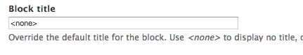
- Enter <none> in the Block title field to ensure there is no title in the Block.
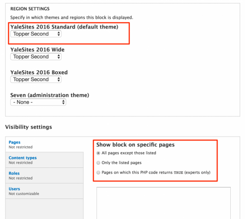
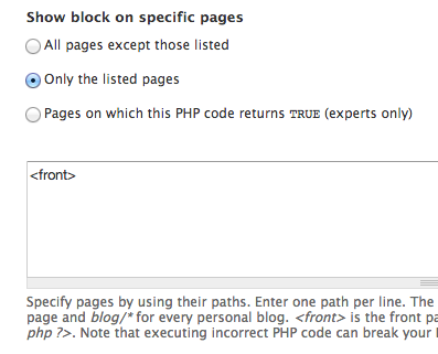
- Assign the Block to the Topper Second Region and check the All pages except those listed radio button.
- In Block List, rearrange the Blocks in the Topper Second Region so that the Search Block is ABOVE the Secondary Menu Block.

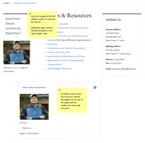
Correct Use of Sidebars
As with the original YaleSites Themes, the YaleSites 2016 Themes reserve use of the Left Sidebar for section Menus only. Additional content should always be placed in the Right Sidebar only. Please note the following along with their corresponding screenshots, attached:
- Sections Menus used on Pages should always appear in the Left Sidebar.
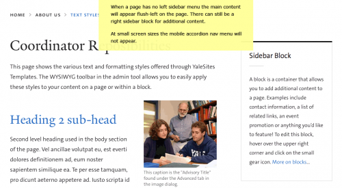
- If a given page does not include a Section Menu then the main content column will simply be flush left with the page, and this is by design.
- Changing the sidebar block styles under Design Options will only affect the right sidebar blocks for additional content.
- Any given page can simply have one main content column without any Sidebars at all and this is perfectly OK.
- There is no urgent need to fill both sidebars.
Correct Sidebars
- Left sidebar is intended for Secondary Menus only, not for other content. These Menus do not need to have a Block heading. At small screen sizes these menus will fold-up into an accordion style Mobile Nav Menu.
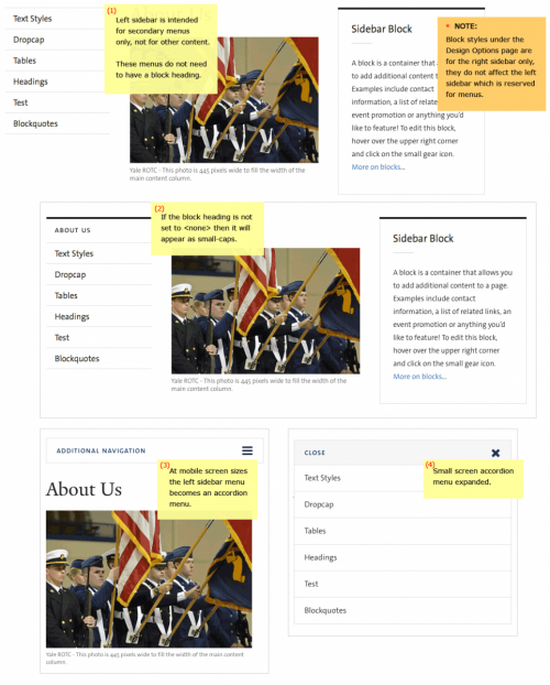

Incorrect Use of Sidebars
- If other content is placed in the left sidebar it will not be hidden or moved properly for mobile devices and the Mobile Nav Menu will not function, it will be broken instead. This content should only be in the Right Sidebar.

Pages with No Left Sidebar
- When a page has no Left Sidebar Menu, the main content will appear to the left of the page. You can add a Right Sidebar Block for additional content.

Additional Block Styles
Changing Sidebar Block Styles
Change Top Accent Color

- accent-carbon
- accent-blue-dk (Yale blue)
- accent-blue-med
- accent-green
- accent-orange
Reverse Block Title Against a Full Background Color

- callout-block (carbon color)
- callout-gray (dark gray color)
- callout-blue-dk (Yale blue)
- callout-blue-med
- callout-green
- callout-orange
Remove Block Line
- Add the block class “no-line-heading” to a block when you want a plain heading without a short underline.


Remove Accent Color (for all blocks site-wide)
To strip all the default styling add the class “block-plain” to the block.

When the Block Styles don’t display
Some Modules include Blocks that are missing the block-block CSS style that is necessary to use the styles listed in the examples above. When you come across a Block that doesn’t have the styling, just add block-block to the CSS styles field.
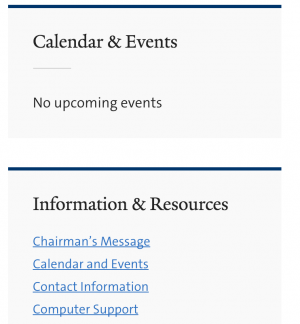
Agenda Module Block Configuration
Below is an example of a Block created by the Agenda Module.
- Only the accent-blue-dk style is applied but does not change the heading for the Calendar & Events block


- Adding the block-block style fixes the problem.

Removing “block lines” from all blocks site-wide
In order to remove the “block line” separating the block body from the header field, the block must be assigned the CSS class “no-line-header”. However, adding this style will only remove the “block line” under the header if the block is being displayed in one of the “Sidebar” content regions. In order to make this class effect all blocks site-wide, a special CSS rule needs to be created.
Creating a new CSS rule
- Enable the “CSS Injector” Module.
-
Access the module by navigating to Configuration > Development > CSS Injector

-
Create a new rule, title it “main CSS”
-
Paste the following CSS code in the “CSS Code” field:
.no-line-heading h2.block-title::after {
content: none !important;
}
-
Make sure the radio button “Add on every page except the listed pages” is selected, and uncheck “preprocess CSS” if it is checked. Click “Save”.
Text Styles
Additional formatting styles are now available to enhance your YaleSite.
Introduction and DropCap Styles
Introduction and DropCap styles have been added to be used for the first paragraph of a page. These styles affect the whole paragraph, so the styles should be added after the entire page of text has been added. Otherwise, each paragraph you add will inherit those special styles and cause each following paragraph to have the same style (which looks pretty bad). These are block level styles that do not reset when using the return or enter key to create a new paragraph.
Best practice is to enter your paragraphs in CKEditor first, then select a paragraph and choose either the Intro or DropCap style from the Block Styles dropdown.

- Each style should only be used on the first “top” paragraph of a page, and it should only be used once.
- These styles are optional.
Block Quote and Citation
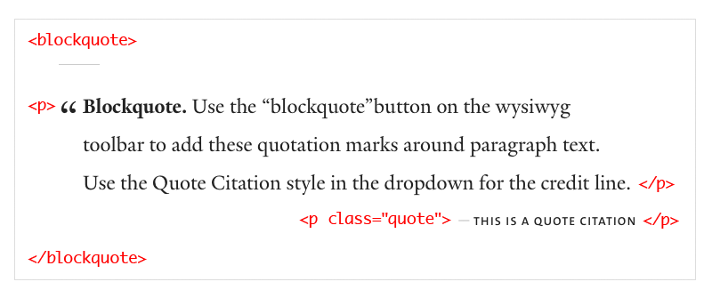
Table Styles
Tables should only be used when you have data that needs to be stored in tabular form. CSS, not tables, should be used for layout purposes.
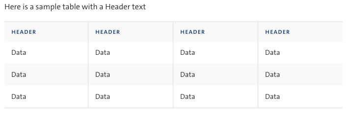
Here is a sample table with the Blue Table class

Here is a sample table with a Table Gray text

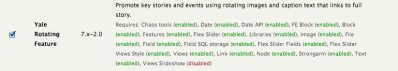
Rotating Feature Slideshow
YaleSites 2016 Themes offers the ability to create a rotating feature so you can promote news and events that link directly to the news article or event. Rotating Feature image, caption and link to the story are added individually and display as a block that cycles through the each of the images. This feature is intended to display on the home page.
Creating Rotating Features
- Enable the Yale Rotating Feature - Modules > Features > Yale Rotating Feature
- Create at least 2 Rotating Features - Content > Add Content > Rotating Feature
- Fields descriptions:
- Title - title displays as a link in the feature
- Date - date of the feature publication
- Feature Image - Upload an image
- Caption - teaser text that displays with the image and title.
- Add the Related Story URL - this is the website that displays when the link in the title is clicked.
- Scroll down and Save the feature.
- Be sure to add at least 2 rotating feature images with title, teaser and related link.
Displaying the Rotating Feature on the Home Page
The Rotating Feature displays in a Block that is created by the Rotating Feature View. This Block is located in the Disabled section of your Blocks Listing page. In order for the Rotating Feature to display, you need to assign it to the Header First region and indicate you only want it to display on the home page.
- Click on Structure > Blocks in the Administration toolbar.
- Scroll down to the Disabled area and locate the View:Rotating Feature Block.

- Click on configure and complete the following:
- Enter <none> in the Block title field to ensure there is no title in the Block.
- Select the Header First Region to place the Block in that area for your theme.
- Indicate you want the Block to display only on the home page in the following way:
Adjusting the Main Menu Width
If you have more menu options than space, you can adjust the padding to better fit those options in the following way:
- Click on the gear icon and select Configure Block to access the admin configuration for the Menu.
- Enter menu-small in the CSS class(se) field.
- Save your configuration.
Making a Page Full Width
By default the main content column in the YaleSites 2016 Themes has a limit to the full width of the page to keep text heavy pages from overwhelming the page the site visitor. However, some pages may have a large table that needs to fill the width of the page. In order to create a page layout that spans the entire width of the page, you will need to create a Delta that eliminates that region and assign it to the specific pages using Context.
Creating the Delta
In this example we are going to create a new Home Page layout that eliminates the Sidebar Second Region to create a full page width layout. Important Note: The Delta is associated with a specific Theme, so if you switch from Boxed to Wide, you must create a new Delta for the Wide theme.
- Go to Appearance > Delta > Add
- Enter a title (Full Width Wide Theme) and description - this will show up on the Delta listing. Be sure to be as specific as you want so you will know what each title is when interacting with other modules.
- Next, set which YaleSites 2016 Theme should be used as the basis for your Delta.
- Select the Override all Values radio button
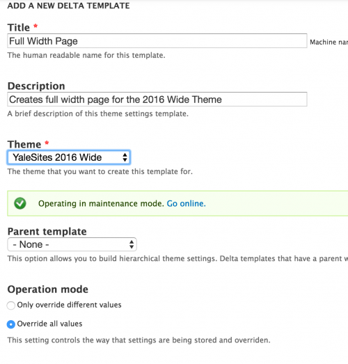 .
. - Click Save. You are brought to the Delta listing display.
Configuring the Delta
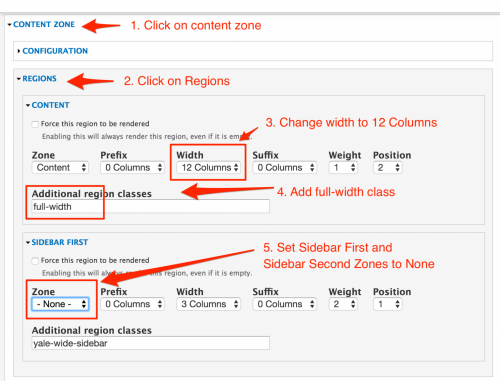
Now that your Delta is created, you need to configure Content Region and Zone settings. Click on Configure link in the row for the Full Width Delta you are configuring. Then:
- Click on Zone and Regions in the Vertical Tabs at the top of the configuration page.
- Click on the Content Zone and click on Regions.
- In the Content area, change the Width to 12 Columns.
- Add full-width to the Additional region classes field.
- Set the Zone to None in the Sidebar First and Sidebar Second Regions.
Note: This will not work correctly if there are any sidebars, the page must only have a main content column that needs to be full-width. Do not use on all pages, only special pages that are set up for this with their own Delta theme settings.
Assigning the Delta to Specific Pages with Context
Once you have created the Delta, you need to assign the pages that require Full Width.
- Select Structure > Context > Add
- Add the Name and Description (shows up in the list of Contexts)
- Choose a condition and configure it.
- Choose Path to indicate the pages you want this Delta to display; use only the page URL, not the full domain (i.e. sitename.yale.edu)
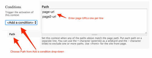
- Enter the URLs for the pages: i.e. about, contact, etc.
- Choose Path to indicate the pages you want this Delta to display; use only the page URL, not the full domain (i.e. sitename.yale.edu)
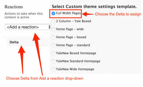
- Choose a reaction and configure it.
- Choose Delta from the Add a Reaction drop-down to indicate which Delta should be used.
- Click on the Full Width Pages Delta radio button.
Rotating Banner Image Sizing
Since the 2016 Themes are wider than the original Themes, larger images need to be used for the rotating/splash photos for the home page. In addition, the size of these images is different based on the Theme chosen.
New sites will deploy with sample photos that are sized 1500 x 783 pixels. Although these will scale down for the smaller width themes, for optimum image display, the site owner should update their photo content using the size that works best for their Theme. There is no built-in image cropping/resizing for this.
- Standard: 766 x 400 pixels
- Boxed: 1284 x 450 pixels
- Wide: 1500 x 525 pixels