Working with blocks
A Block is a container that allows you to add additional content to a region in your page. You can add images, contact information, a list of related links, an event promotion or anything you’d like to feature!
Blocks can be:
- dynamic or static; generated as a Block display in a View, on-the-fly by various modules, or created with static text/images.
- configured to display on specific pages, content types, and/or for specific people or types of people (roles).
- assigned to the various Regions on your site.
Adding a Block
Create Blocks based on the needs of a specific site structure.
- Select Structure -> Blocks from the Administrator’s toolbar.
- Click on the + Add block link above the list of links.
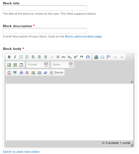
- Enter the name of the Block in the Block title; this is shown as the title of the block to the user when placed in a Region.
- Enter a description in the Block description; this is shown on the Administration page to identify the Block.
- Enter text and images in the Block body.
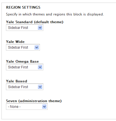
- Scroll down and select the Regions you want this block to display on.
- Indicate the pages you want the block to display/not display, Content Types it should be available for, and/or the Roles who should be able to see this block.


Editing Blocks
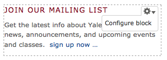
You can easily edit the content in any Block using the Gear icon that is a new feature in D7. Simply hover over the upper right corner of your Block. A contextual menu displays with options available based on the type of block you are working with:
- Menu - List links, Edit menu, Configure block
- View - Edit view, Configure Block
- Block - Configure block
Select the option Configure block and it brings you to the configuration area for that specific block.
Block Class
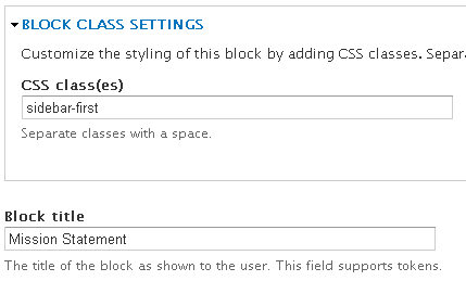
Block Class allows you to add CSS classes to any block through the block’s configuration interface.
- Enable the module Modules -> Block Class
- Create a Block (Structure -> Blocks -> Add Block)
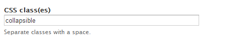
- Add the class name to the Block in the CSS class(es) field - if the CSS style is not part of the site, you need to add it using CSS Injector module.
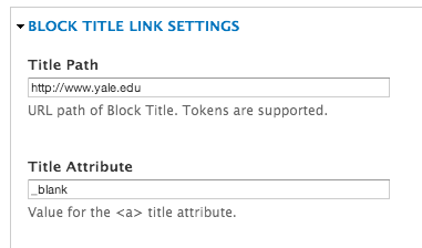
Block Title Link
Allows you to turn the Title of your Block into a clickable link. When the module is enabled, the Block Title Link Settings section displays below the Block Body field in the Block configuration. Just add the path and title link attribute (_blank to open in a new window) and the title of your Block is a link.
Collapsiblock
Collapsiblock makes Blocks collapsible so you can show/hide content by clicking on the title of the Block. This is a great way to incorporate accordion style effect for a full node/page or in a sidebar region of your site. Simply create individual Blocks for each section you want to expand and/or collapse and assign them to a specific region and page. Important Note: These instructions are specific to the YaleSites instance of Drupal using the YaleSites Templates with Omega as the base theme.
- Enable the Module: Modules -> Collapsiblock
Configure the Theme:
- You may need to override the CSS selectors that come with Collapsiblock in the following way. The Block settings are specific for Omega Theme used for YaleSites Templates and may need to be changed for custom themes or other base themes.
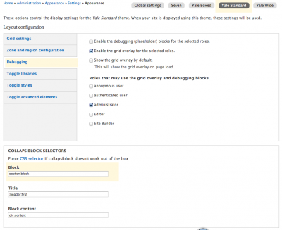
- Click Appearance > Settings > Global Settings and Also the Settings for your Theme
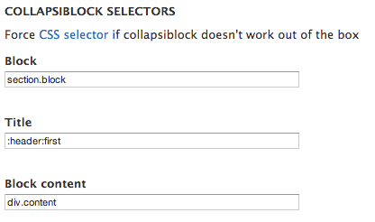
***NOTE: the CSS selector under Block should be “.block” NOT “section.block” ***
Global Settings CSS Settings
Example of Theme Settings - Yale Standard- Click on the Yale Standard tab in the same line as Global settings (choose the tab for the Yale template you are using.
- Click on the Debugging Vertical Tab and the Collapsiblock Selectors displays below.
- Make changes based on the image below.
Configure the Module:
You should only do this if you want every block on your site to have this behavior.
- Click on Configuration on the Toolbar and click on Collapsiblock in the User Interface section.
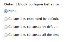
- Configure based on the image below to set the Default behavior. This will determine the behavior for ALL blocks throughout your site.
- You can also change the animation type and speed as desired.
Configure Each Block
In order to get the expand/collapse effect, each block need to be configured. When the Collapsiblock module is enabled, each Block has a Collapsiblock section after the Block is created.
- Open the Block: Structure -> Block and change the configuration for that block.

And here:
- Save the block. It is important to note that this section does not show up until after the block is created.
Field as Block
Field as Block allows you to take a simple Field and display it as a Block on the current page. This block can eliminate the need to use other complex Modules such as Views, Panels or Display Suite by providing an easy way to display related information in the desired Regions of the page.
Configuring the Field to Display as a Block
- Enable the Module - Modules > Field as Block
- Select and open the Content Type with the Field you want to display as a Block - Structure > Content Types > [Content Type Name]
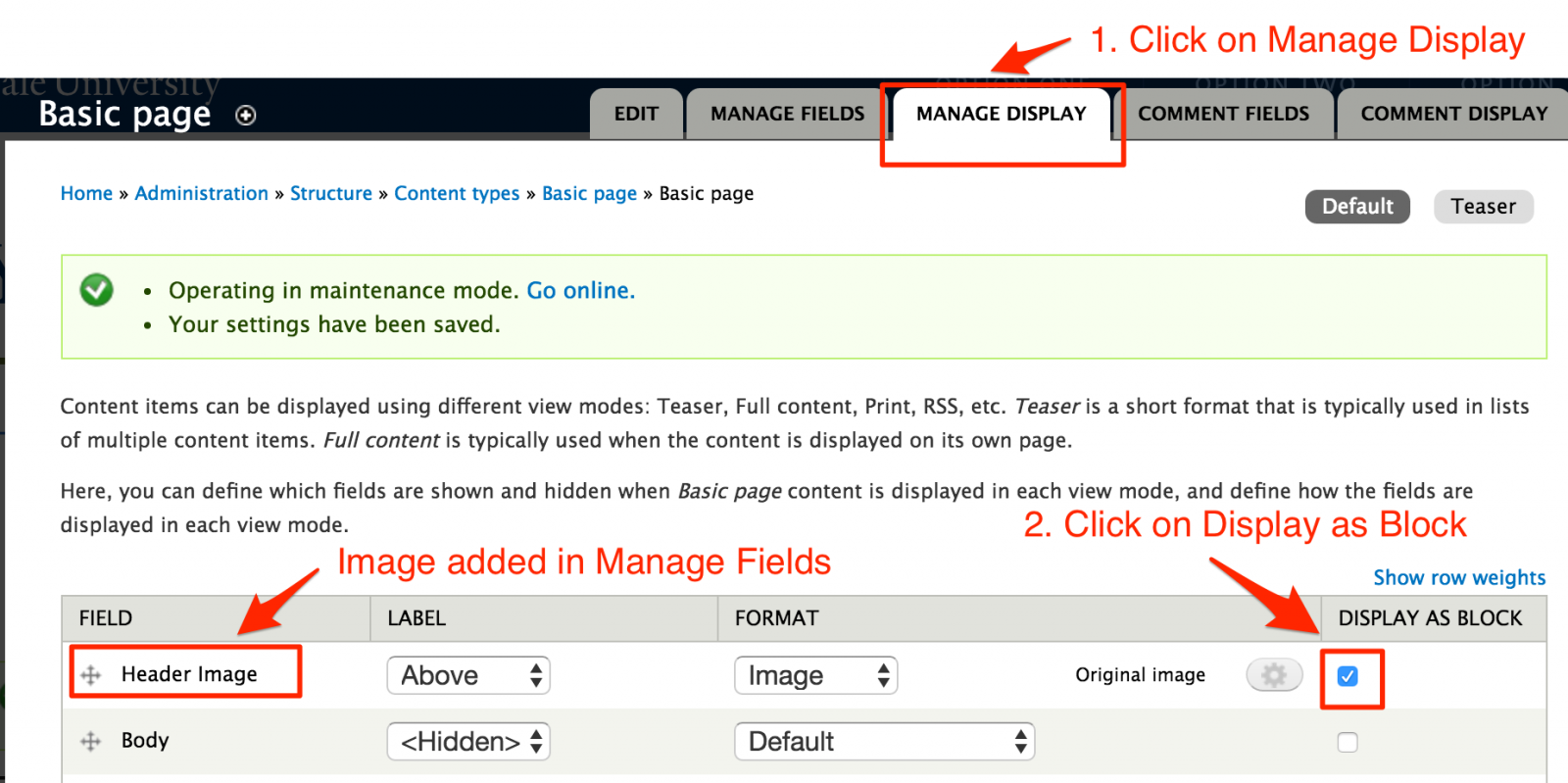
- Click on Manage Display and locate the field.
- Click on the Display as Block check box for each field you want to display as a Block.
Assigning the Block to Display in a Region
Create a page and add the Fields. You will notice that when you Save the page, the Fields don’t display. That is because they are now Blocks and they need to be assigned to the appropriate Regions.
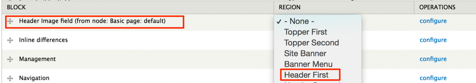
- Go to the Blocks Listing page - Structure > Blocks.
- Scroll down to the Disabled section and locate the field.
- Assign the Field to the Region.
 Important Note: You DO NOT need to assign this to specific pages. The Module is built to know what page the Block displays based on the content added to the page.
Insert Block
Insert Block allows you to embed blocks into the body of your page without any intensive coding. You just need to identify the Block “Delta” and paste a line code in the body of the page where you want the block to display.
What’s a Block Delta?
In simple terms, the Delta of a block is machine code that identifies the block. However, finding the delta for your block can be a bit challenging if you don’t know where to look.
To find the Delta:
- Open the Blocks listing page
- Locate the block you want to embed on your page.
- Hover over the configure link for that block and you’ll see reference code in the status bar for the block.
Example: admin/structure/block/manage/views/portfolio-block_1/configure
portfolio-block_1 is the delta
Using Insert Block
- Enable the module – Modules > Insert Block – click on the check box and Save.
- Configure Filtered Text format to accept Insert Block code.
- Configuration > Content Authoring > Text Formats > Filtered HTML
- Scroll down and locate Insert Blocks under Enabled Filters
- Save configuration.
- Insert the following code into the location of your page and adjust it to point to the block.
– where name of module is the name of the module that created the block i.e. views
– delta of block is the machine name discussed in the section above i.e. portfolio-block_1 .
- Save the page.
Example:
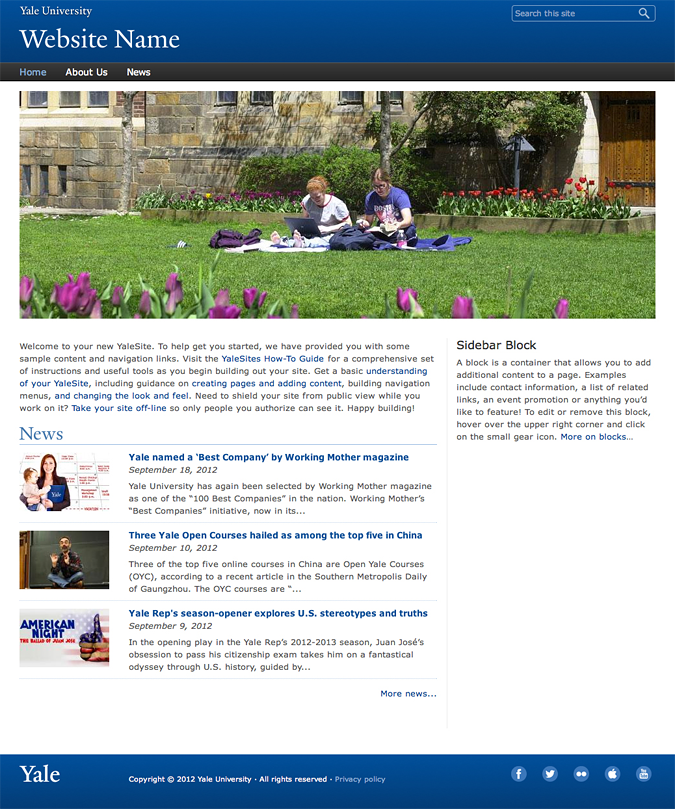
This is a Block create from a View that displays the 3 YaleSites Themes.
|
Boxed
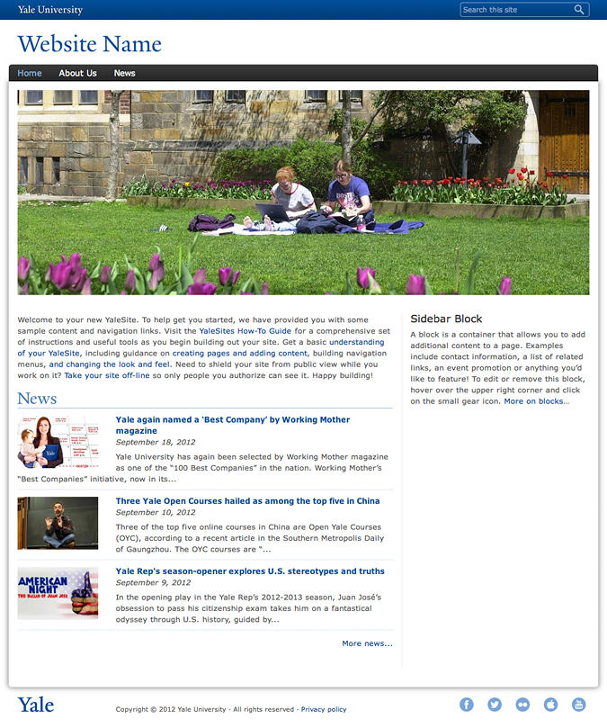 |
Standard (Default)
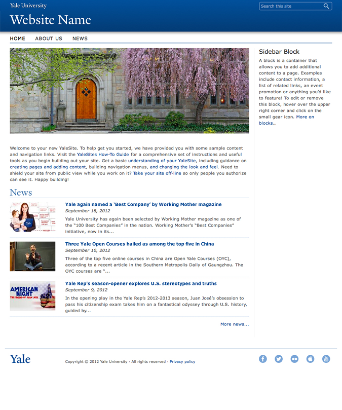 |
Wide
 |
Twitter Block
Version 7.x-1.0 (please see alternate instructions for 7.x-2.0)
Allows you to create a block that lists Twitter posts for a specific account. It is relatively easy to configure.
- Enable the Twitter Block module and a Discussions on Twitter block is available in the Disabled area of the Blocks listing.
- Click on configure and scroll down to the Twitter Block Configuration section (if your configuration block doesn’t look like this, please see the 7.2 instructions)
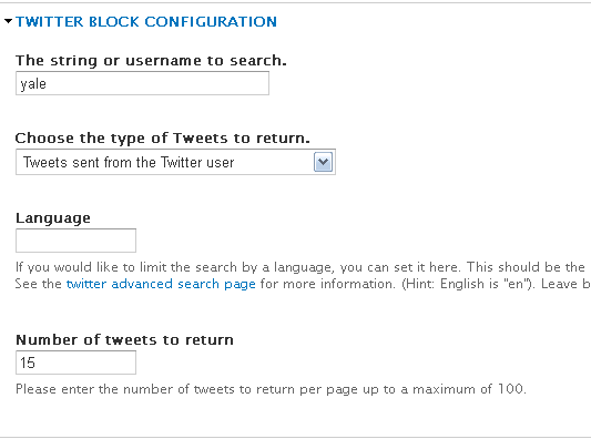
- Enter your Twitter Account user name in The string or username to search.
- Choose type of tweets to display
- Enter the number of tweets to list in the block.
-
As with all blocks, indicate the region (Sidebar First or Second)and pages you want the block to display.
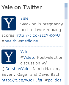
- Save the configuration. Your block will display in the region with the most recent tweets.
Twitter Block 7.x-2.0
Twitter Block Module is a 2 step configuration process: 1) get a Twitter ID for the Widget you want to display. 2) configure the Twitter Block Module.
1) Acquire a Twitter ID
The Twitter ID you will use is associated with a specific widget you want to use (User timeline, Favorites, List, etc). to create the Widget and then find the Twitter ID for that Widget:
- Login to your Twitter Account.
- Click on your picture in the upper right corner and then the Settings link in the resulting drop-down.
- Click on Widgets, the very last option under the Settings Menu on the left.
- Click on Create New in the middle pane to create a new widget.
- Choose the type of widget you want to create.
- Enter the Twitter Username and configure based on preferences.
- Click on Create Widget and copy and paste the embed code to a text editor. Then locate the Twitter ID for the Widget after the following text: data-widget-id=“12345678910” (this is not a real Twitter ID).
2) Configure the Twitter Block
Create and configure the Twitter Block as follows.
- Enable the Twitter Block module.
- Enter a Block Title and Description as you would for any Block.
- Add the Twitter ID from step 1 in the Widget ID field.
- Configure the rest of the Block based on the instructions for each field.
- Assign to the Block to regions and pages as desired.