Site Building
This section serves as a convenient resource on the basic things necessary to build your YaleSite with Drupal 7. These instructions are intended for Administrators and Site Builders, those who have permission to change the structure of your site and can perform all functions available in the YaleSite, including module configuration, user management, etc.
Working with blocks
A Block is a container that allows you to add additional content to a region in your page. You can add images, contact information, a list of related links, an event promotion or anything you’d like to feature!
Blocks can be:
- dynamic or static; generated as a Block display in a View, on-the-fly by various modules, or created with static text/images.
- configured to display on specific pages, content types, and/or for specific people or types of people (roles).
- assigned to the various Regions on your site.
Adding a Block
Create Blocks based on the needs of a specific site structure.
- Select Structure -> Blocks from the Administrator’s toolbar.
- Click on the + Add block link above the list of links.
- Enter the name of the Block in the Block title; this is shown as the title of the block to the user when placed in a Region.
- Enter a description in the Block description; this is shown on the Administration page to identify the Block.
- Enter text and images in the Block body.
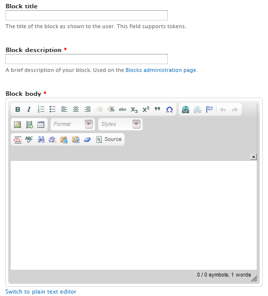
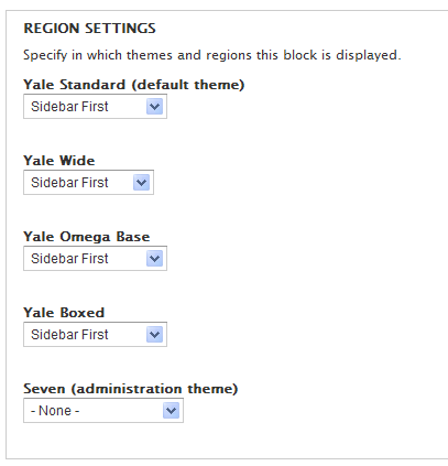
- Scroll down and select the Regions you want this block to display on.
- Indicate the pages you want the block to display/not display, Content Types it should be available for, and/or the Roles who should be able to see this block.


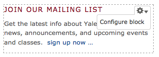
Editing Blocks
You can easily edit the content in any Block using the Gear icon that is a new feature in D7. Simply hover over the upper right corner of your Block. A contextual menu displays with options available based on the type of block you are working with:
- Menu - List links, Edit menu, Configure block
- View - Edit view, Configure Block
- Block - Configure block
Select the option Configure block and it brings you to the configuration area for that specific block.
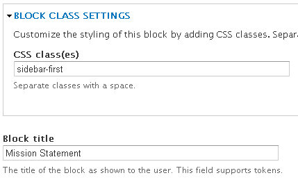
Block Class
Block Class allows you to add CSS classes to any block through the block’s configuration interface.
- Enable the module Modules -> Block Class
- Create a Block (Structure -> Blocks -> Add Block)
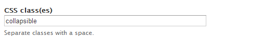
- Add the class name to the Block in the CSS class(es) field - if the CSS style is not part of the site, you need to add it using CSS Injector module.
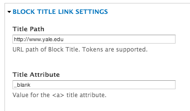
Block Title Link
Allows you to turn the Title of your Block into a clickable link. When the module is enabled, the Block Title Link Settings section displays below the Block Body field in the Block configuration. Just add the path and title link attribute (_blank to open in a new window) and the title of your Block is a link.
Collapsiblock
Collapsiblock makes Blocks collapsible so you can show/hide content by clicking on the title of the Block. This is a great way to incorporate accordion style effect for a full node/page or in a sidebar region of your site. Simply create individual Blocks for each section you want to expand and/or collapse and assign them to a specific region and page. Important Note: These instructions are specific to the YaleSites instance of Drupal using the YaleSites Templates with Omega as the base theme.
- Enable the Module: Modules -> Collapsiblock
Configure the Theme:
- You may need to override the CSS selectors that come with Collapsiblock in the following way. The Block settings are specific for Omega Theme used for YaleSites Templates and may need to be changed for custom themes or other base themes.
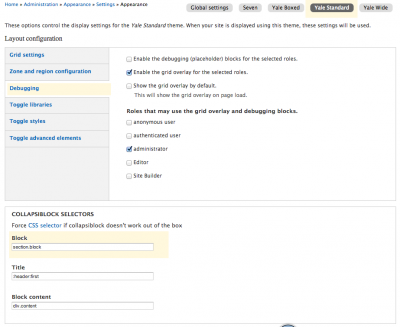
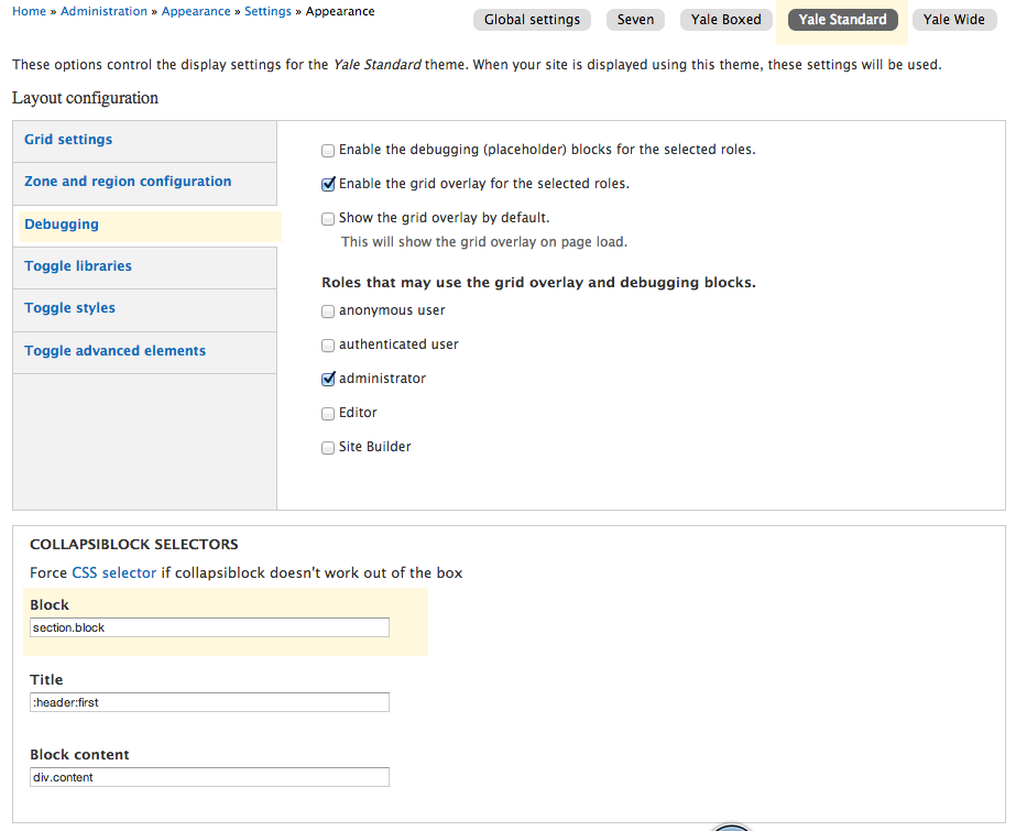
- Click Appearance > Settings > Global Settings and Also the Settings for your Theme
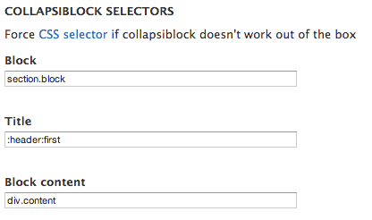
***NOTE: the CSS selector under Block should be “.block” NOT “section.block” ***
Global Settings CSS Settings
Example of Theme Settings - Yale Standard- Click on the Yale Standard tab in the same line as Global settings (choose the tab for the Yale template you are using.
- Click on the Debugging Vertical Tab and the Collapsiblock Selectors displays below.
- Make changes based on the image below.
Configure the Module:
You should only do this if you want every block on your site to have this behavior.
- Click on Configuration on the Toolbar and click on Collapsiblock in the User Interface section.
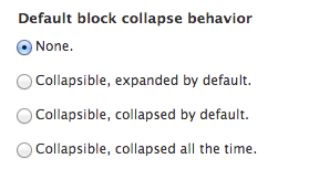
- Configure based on the image below to set the Default behavior. This will determine the behavior for ALL blocks throughout your site.
- You can also change the animation type and speed as desired.
Configure Each Block
In order to get the expand/collapse effect, each block need to be configured. When the Collapsiblock module is enabled, each Block has a Collapsiblock section after the Block is created.
- Open the Block: Structure -> Block and change the configuration for that block.

And here:
- Save the block. It is important to note that this section does not show up until after the block is created.
Field as Block
Field as Block allows you to take a simple Field and display it as a Block on the current page. This block can eliminate the need to use other complex Modules such as Views, Panels or Display Suite by providing an easy way to display related information in the desired Regions of the page.
Configuring the Field to Display as a Block
- Enable the Module - Modules > Field as Block
- Select and open the Content Type with the Field you want to display as a Block - Structure > Content Types > [Content Type Name]
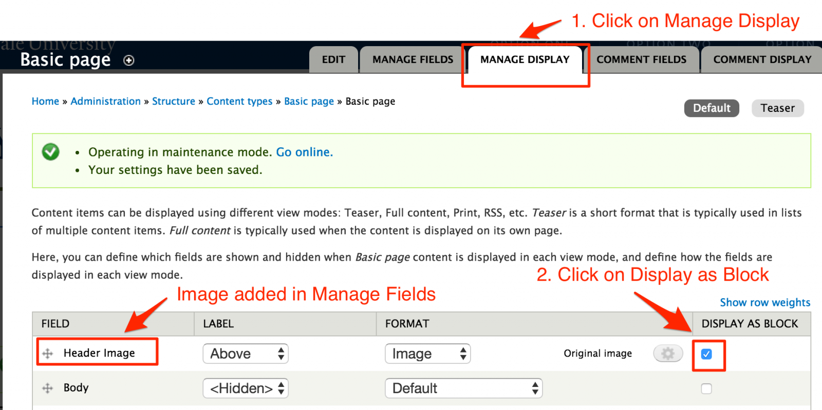
- Click on Manage Display and locate the field.
- Click on the Display as Block check box for each field you want to display as a Block.
Assigning the Block to Display in a Region
Create a page and add the Fields. You will notice that when you Save the page, the Fields don’t display. That is because they are now Blocks and they need to be assigned to the appropriate Regions.
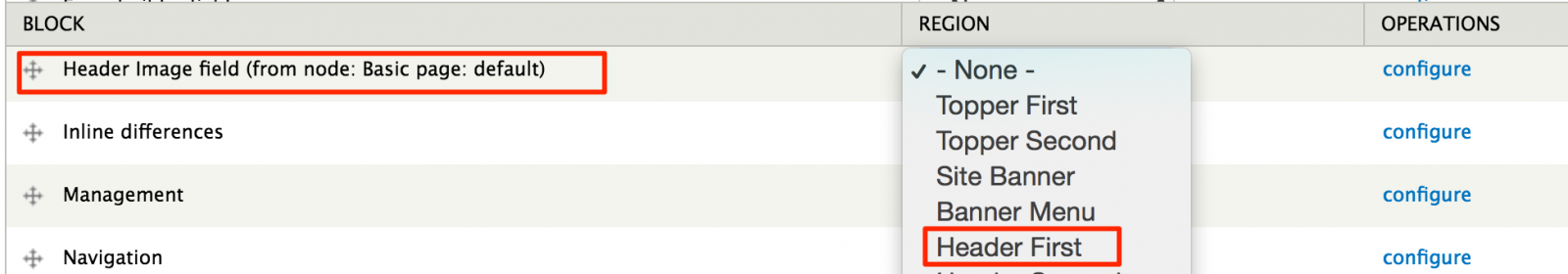
- Go to the Blocks Listing page - Structure > Blocks.
- Scroll down to the Disabled section and locate the field.
- Assign the Field to the Region.
 Important Note: You DO NOT need to assign this to specific pages. The Module is built to know what page the Block displays based on the content added to the page.
Insert Block
Insert Block allows you to embed blocks into the body of your page without any intensive coding. You just need to identify the Block “Delta” and paste a line code in the body of the page where you want the block to display.
What’s a Block Delta?
In simple terms, the Delta of a block is machine code that identifies the block. However, finding the delta for your block can be a bit challenging if you don’t know where to look.
To find the Delta:
- Open the Blocks listing page
- Locate the block you want to embed on your page.
- Hover over the configure link for that block and you’ll see reference code in the status bar for the block.
Example: admin/structure/block/manage/views/portfolio-block_1/configure
portfolio-block_1 is the delta
Using Insert Block
- Enable the module – Modules > Insert Block – click on the check box and Save.
- Configure Filtered Text format to accept Insert Block code.
- Configuration > Content Authoring > Text Formats > Filtered HTML
- Scroll down and locate Insert Blocks under Enabled Filters
- Save configuration.
- Insert the following code into the location of your page and adjust it to point to the block.
– where name of module is the name of the module that created the block i.e. views
– delta of block is the machine name discussed in the section above i.e. portfolio-block_1 .
- Save the page.
Example:
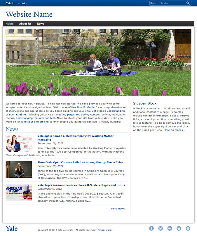
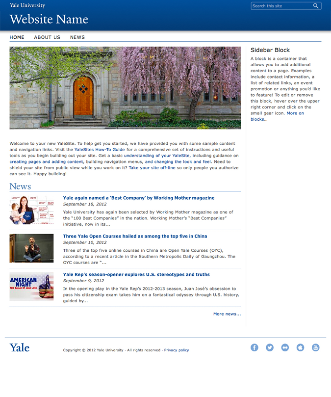
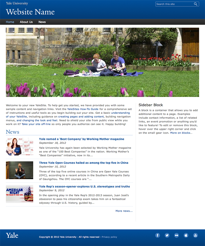
This is a Block create from a View that displays the 3 YaleSites Themes.
|
Boxed
 |
Standard (Default)
 |
Wide
 |
Twitter Block
Version 7.x-1.0 (please see alternate instructions for 7.x-2.0)
Allows you to create a block that lists Twitter posts for a specific account. It is relatively easy to configure.
- Enable the Twitter Block module and a Discussions on Twitter block is available in the Disabled area of the Blocks listing.
- Click on configure and scroll down to the Twitter Block Configuration section (if your configuration block doesn’t look like this, please see the 7.2 instructions)
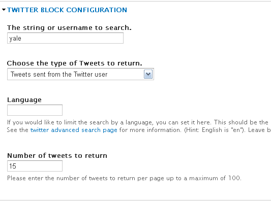
- Enter your Twitter Account user name in The string or username to search.
- Choose type of tweets to display
- Enter the number of tweets to list in the block.
-
As with all blocks, indicate the region (Sidebar First or Second)and pages you want the block to display.
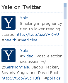
- Save the configuration. Your block will display in the region with the most recent tweets.
Twitter Block 7.x-2.0
Twitter Block Module is a 2 step configuration process: 1) get a Twitter ID for the Widget you want to display. 2) configure the Twitter Block Module.
1) Acquire a Twitter ID
The Twitter ID you will use is associated with a specific widget you want to use (User timeline, Favorites, List, etc). to create the Widget and then find the Twitter ID for that Widget:
- Login to your Twitter Account.
- Click on your picture in the upper right corner and then the Settings link in the resulting drop-down.
- Click on Widgets, the very last option under the Settings Menu on the left.
- Click on Create New in the middle pane to create a new widget.
- Choose the type of widget you want to create.
- Enter the Twitter Username and configure based on preferences.
- Click on Create Widget and copy and paste the embed code to a text editor. Then locate the Twitter ID for the Widget after the following text: data-widget-id=“12345678910” (this is not a real Twitter ID).
2) Configure the Twitter Block
Create and configure the Twitter Block as follows.
- Enable the Twitter Block module.
- Enter a Block Title and Description as you would for any Block.
- Add the Twitter ID from step 1 in the Widget ID field.
- Configure the rest of the Block based on the instructions for each field.
- Assign to the Block to regions and pages as desired.
Working with menus
Menus are a set of links that allow site visitors to locate content on your site. When a Menu is created it is available as a Block and can be placed in the various regions of your site. Like Blocks, menus can be configured to display on specific pages, content types, and/or for specific people or types of people (roles).
There are two menus you can use to manage your navigation.
- Main Menu – the main navigation of the site that displays across the top of your site.
- Sub Menu - links that appear in your left navigation.
Adding a Menu
You can also create additional menus based on the needs of a specific site structure.
- Select Structure -> Menus from the Administrator’s toolbar.
- Click on the + Add menu link above the list of links.
- Enter the name of the menu and a description (optional)
Adding a Link to your Menu
Once your menu is created you can add an item to it. These steps are useful for adding links to files or pages outside of your site. If you are adding new pages to your site, you could add them to the menu as you create the pages. (See Add your page to a Menu)
- Click on the + Add link
- Enter the text you want to display as the link in the menu and the path to the URL you want the link to open.
- for pages within your site enter a forward slash (/) and the URL (/url-path see example below)
- for pages outside your site, enter the full URL including http://
- The Parent menu defaults to the menu you have just created.
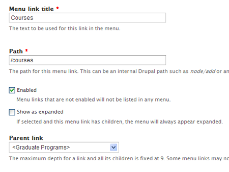
- Scroll down and Save the menu link.
- Repeat for each menu item you want to add.
Opening External Links in a New Window
If you add a link to an external site, it is recommended you open that link in a new window. To do this, you need to enable the Menu Attributes module. Once enabled, you can configure each link to open in a new window.
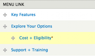
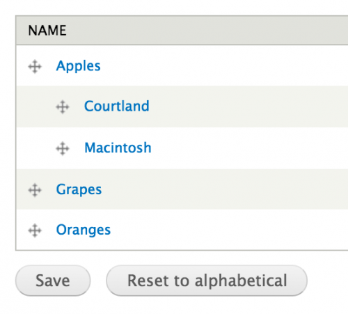
Rearranging the Order of Menu Items
Once your menu has been created, you might want to rearrange the order. Simply:
- Go to your Menu - Structure > Menus or click on the Gear Icon and select List Links.
- Press, hold and drag the 4-pronged arrow to the desired location.
- To create child or sub menus, drag the item over and under the item you want to be the main item.
Creating categories with taxonomy
Taxonomy is a way to categorize your content using “tags”. Once tagged, the content can be grouped and listed based on the terms associated with the content.
A Taxonomy group is called a Vocabulary; a specific tag is called a Term. Once a Vocabulary is created, Terms are added. Then the Taxonomy can be added to the Content Type as a Term Reference field type.
To add Taxomony Vocabulary
- Select Structure > Taxonomy from the Administration Menu.
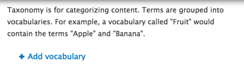
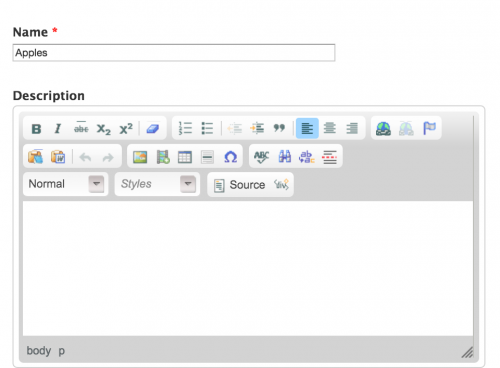
- Click on Add vocabulary and add the name for the Vocabulary (description is optional).

- Click on Add terms and add terms and term name

- Enter the name of the term, scroll down and click Save.
- Repeat this process until you have all the terms added.
- You can create a hierarchical list of terms by selecting the parent term before saving.

- When you are done, you can rearrange as desired using the arrow icon and dragging the term to the appropriate location.
Creating Custom Content Types and Fields
Different types of content have different meanings. Content Types allow you to define the content on your site using fields to capture pieces of information independently of one another. Each Content Type is treated differently; different properties, fields, page displays, etc. With Content Types, you can arrange what and how you want your content to be displayed as well as control who manages and creates that type of content.
Your YaleSite has built-in features that provide Content Types to make it easier for you to create, update and display your information about your department or organization. In addition to creating basic pages with the Basic Page Content Type, you can create the following types of content providing the features are enabled on your site:
- Basic page
- Event
- News
- Private Files
- Rotating Header Image
- Slideshow
- Video
Adding Fields to your Content Type
Fields allow you to capture small pieces of information, providing more control and flexibility in the display of content. Using Fields allows you to treat small pieces of content as an individual entity so that it can be listed in a specific order or formatted differently from the other text. For example, if you wanted to capture the phone number of staff members, you can control how the format of the number (###) ###-####, make it bold, and list it below the staff members name.
To define a field, you must consider the following:
- Name of the field
- Type of data the field will store
- How the data will be input and displayed
- How many values the field will store
Field Types
|
When adding fields you will select field type and configure as directed |
Select Widget |
|
Boolean (on/off) |
|
|
Date |
|
|
Email – displays clickable email |
|
| Entity Reference – connect to other content types/user profiles |
|
| File – upload files, pdf, doc, xls etc |
|
| Integer - for numbering and sorting |
|
| Image – upload images |
|
| Link |
|
| Text |
|
| List (text) - radio buttons or check lists |
|
| Long Text – multiple rows |
|
| Long Text and Summary |
|
| Term Reference - referenced from taxonomy list |
|
| Video Embed |
|
Additional Field Types Modules
In addition to the standard fields that are available, the following modules provide more field types that give your more control over the types of content that is entered and how that content displays on the landing page.
- Email Fields - The Email module turns your text field into a clickable email field without additional configuration on the landing page. Read more about the Email Field
- Entity Reference - The Entity Reference Module allows you to create a link to other content types such as a courses or profile page. Read more about the Entity Reference Module
- Link - The Link Module allows you to create a Link field type that, when displayed, shows a clickable link. Read more about the Link Module
- Video Embed - Creates a simple field that allows you to embed 3rd party videos (Vimeo and Youtube). Read more about the Video Embed Module
Useful Modules for Creating Custom Content Types
The following Modules, while not necessary, are commonly used when creating Custom Content Types.
Automatic Nodetitles - Automatic Node Titles allows you to create custom title fields with the use of tokens so you can combine the first name and last name as the title field. Read more about the Automatic Nodetitle Module
Field as Block - This handy little module allows you to take a field and turn it into a Block that you can display in various field. A great way to simplify putting related content in the various regions of your site. Read more about Field as Block Module
External Links - External Links adds icons at the end of your links to indicate if the links point to an external site or is an email link. Read more about the External Links Module
Field Permissions - The Field Permissions module allows administrators to control who sees fields for your content types. For example, you might have a Content Type that captures an email address for the requestor, but you don’t want that information available to all people who view the site. Read more about the Field Permissions Module
Field Redirection - Redirects any field formatter for Link, Term Reference and Entity Reference fields that open a web page or URL. This module automatically redirects a page/node to the URL in the field entered. If no URL is entered in the field, the page/node is opened. A field settings widget is provided to allow selection of the appropriate HTTP status code. Read more about the Field Redirection Module
Fieldgroup - Allows you to create a group for fields created in your content type. Once enabled, the fieldgroup is created as a field and format to display is chosen. Then various fields that are part of that fieldgroup are added via drag-and-drop. Read more about the Fieldgroup Module
Working with Various Field Types
Title field – title of the page, regardless of the content type. The red asterisk * indicates a required field. Important Note: some Content Types have changed the label for the title field to a more appropriate label.

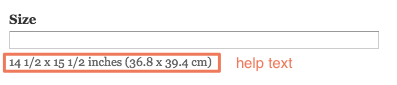
Text field – like the Title field, the Text field allows you to add limited text, but is not necessarily required. When special instructions are required, help text help text displays below the field.
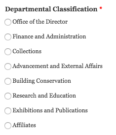
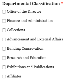
Text List field – allows you to select from a list of options. These options can be check boxes, radio buttons or a select list.
- Select List initial field:
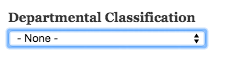
- Click on the arrows and the list displays

- Hover over and click on one of the options and it displays in the field:

Radio Buttons – if a select list displays radio buttons, only one option can be selected.
Check Boxes – if a select list displays check boxes, more than one option can be selected.
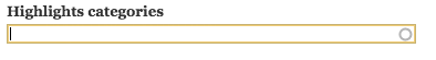
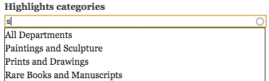
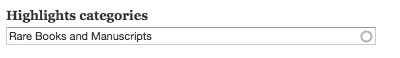
Autocomplete field – options are associated with a list of terms – taxonomy or other text list – allows you to locate the term by typing in a few letters of the word. Options can be chosen from the list that displays as the letters are entered. You can tell that it’s an autocomplete field by the circle that displays at the end of the within the field itself.
- Initial field:
- Enter letters and the list displays.
- Hover over and click on one of the options and it displays in the field:
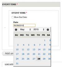
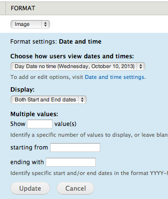
Date/Time field – used to add dates for publications and events. Incorporates a calendar widget to facilitate picking the date and ensure the date format is correct.
- Initial field displays the current date:
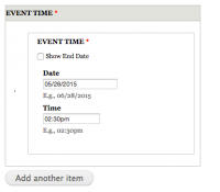
- Click on the Date field and the calendar widget pops up - click on the date:
- Enter the time manually; be sure to include the AM, PM.
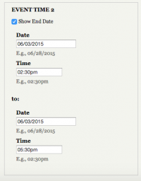
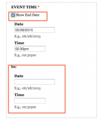
- If you want to display an end date/time for the event, click on the Show End Date check box and fill in the date/time.
- If you want to add multiple dates for an event that has the same name, click on Add Another and add the date/time for the next instance. You can add as many as you like.
Image field – Used to upload an image related to the content. The image field has 2 buttons – the 1st to choose the image, the 2nd to upload the image to the server.
- Locate the image field and click on Choose File. This will bring you to the file manager.

- Locate the image using the file manager and double-click on it.
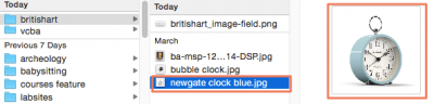
- The image displays next to Choose File, but it’s not uploaded yet.

- Click on the Upload button to upload the image to the server.
- Add Alternate text to meet accessibility standards so the image can be “seen” by screen readers and search engines.
- Add Title text to be used as tooltip text and a caption for the image.

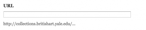
Link field – Used to add a link that is clickable. Link fields have the option to have a custom label or not. If there are 2 text fields to enter, the first field is the Title or label for the link – the text that will display as a link when done. The second text field is for the full URL which MUST include http:// or https://
- Enter the label text in the Title field and the full URL in the URL field.

- Here is a URL with no label and help text to provide guidance and a reminder of how the text should be formatted.
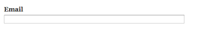
Email field – These fields are usually found in People listings where the email for the associated person is added. Even though the field looks like a text field, when used, the text displays as a clickable link on the landing page.
- Enter the email address in the email field.
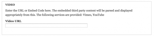
Video field – Used to display video from 3rd party services YouTube and Vimeo. Adding the share URL from either of these services display a play in place video.
- Enter the share URL from Vimeo or YouTube in the Video URL field.
Long Text – Used to add multiple paragraphs of text with no limits. Some Long Text fields have the WYSIWYG toolbar which allows you to format text with limited options.
- Long text with WYSIWYG toolbar
- Long text without WYSIWYG toolbar
Long Text with Summary – allows you to separate the text into 2 independent sections. This is useful when the initial text of this field requires editorial oversight so the text fits within a smaller section or teaser (see http://news.yale.edu home page).
File field – used to upload a PDF, MS Word or other type of document to the site – DOES NOT INCLUDE IMAGES. Like the Image field, the files are uploaded to the website in 3 steps.
- Click on Choose File in the image field. This will bring you to the file manager.

- Locate the file that you want to upload. Be sure the file type is allowed (see help text that indicates allowed file types).
- Click on Upload. The file is uploaded to the website and displays on the landing page.
URL aliases
Your YaleSite automatically creates friendly URLs using Clean URLs and the Path Auto module. When you create and save a page, the URL is translated to the title of the page, replacing spaces with dashes (-) and eliminated words with three letters or less (a, and, the, etc.).
However, there may be times when you want more control over the path generated for pages you create with specific content so that it follows a logical path. For example, you might want to have the URL alias for faculty member pages begin with the word “faculty” – sitename.yale.edu/faculty/john-smith. This can be done with the Automated URL Alias feature. This is especially important to ensure blocks display on specific pages using the shorthand academics/* (all the Academic pages get the Academic Menu Block).
YaleSites URL Alias Settings
It is important to note that URL aliases are set for the Basic Page Content Type and Content Types for other pre-built features.
- The pre-built features are set to define the path starting with the name of the content Type
- sitename.yale.edu/news/news-item-title or sitename.yale.edu/gallery/senior-class-field-trip.
- The Basic Page Content Type using a token that allows you to create pages based on the menu structure. So if you are creating a Basic Page and select Academics as the “parent” menu item, your URL alias would be:
- sitename.yale.edu/academics/page-name
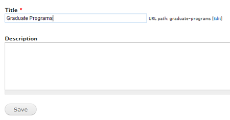
If the “parent” is Graduate Programs under Academics (see Sample Hierarchy above) the URL would be:
- sitename.yale.edu/academics/graduate-programs/page-name.
Creating a URL Alias
If you create your a Custom Content Type you will need to assign a URL alias to that Content Type if you want to defined the path of the URL:
- Go to Configuration -> Search and metadata -> URL Aliases from the administration toolbar.
- Click on the Patterns tab. There you will see several options for creating URL aliases based on the type of content you are working with.
- Select Node paths to create URL aliases for specific types of content.
- Build the path you want to create: Type words to define the base “folder” or “directory”.
- Use tokens/replacement patterns to build the rest of the URL string:
- [node:title] - title of the page
- [yyyy]/[mm]/[dd] - date the page was created
- [node:author] - author name
- [term-raw] - taxonomy term
- Save the configuration. As you create your pages, the URL paths will automatically be built to match your configuration.
Important Note: This is an important step when creating any Content Type to ensure the URL alias is set as content is created. Pages created prior to URL alias setup do not automatically update to the new URL alias.
Displaying content with views
Views are a powerful and flexible way to list and display content. Views can be used to create lists, generate reports, create summaries, and display collections of images or other content. The Views module provides a GUI interface allowing technical and non-technical people to build simple and complex queries with little or no coding. Data is entered once in a Content Type, displayed in various filtering formats and re-purposed throughout the site.
For YaleSites, the custom Views are listed under Structure ->Views in the Administrators toolbar.
Creating Views
Views is a very complex process that requires more than this one page tutorial. However, these instructions will give you an overview of the basic setup.
- Click Structure -> Views -> Add View
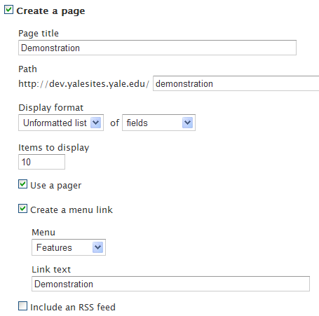
- Enter the View name, path, choose the format and indicate you want to list fields.
- Enter the number of records to display and Menu options.
- Scroll down and enter similar information for a Block display.
- Click on Save and continue working.
The Views Interface
Views are complex but these pointers can help to reduce the complexity. It is important to note that some of the settings change depending on the type of Display you are working with.
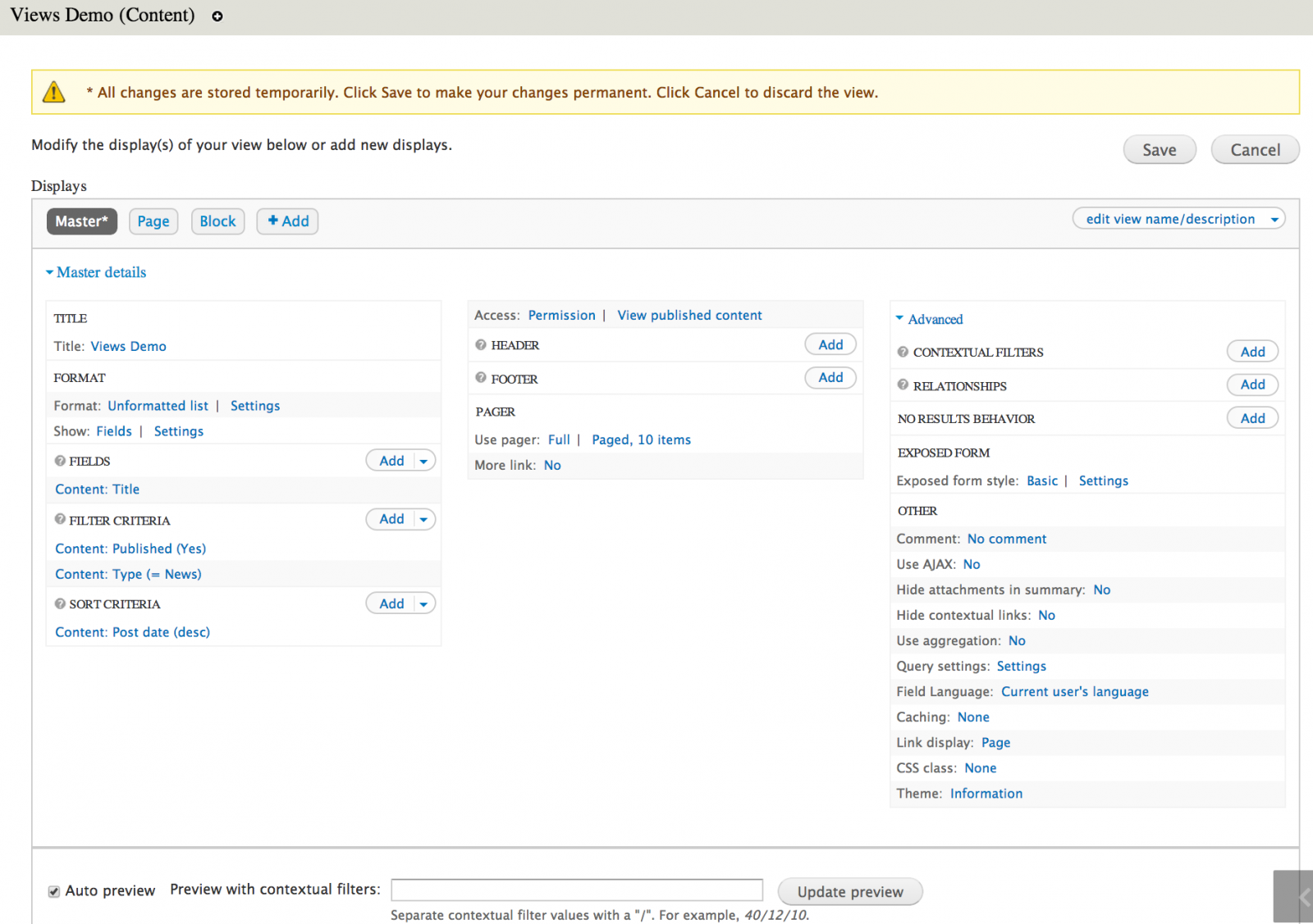
- Master - this is the foundation for other block and page displays. Add the filters, fields and other common settings that you want to use for other displays. These settings can be overridden if need be.
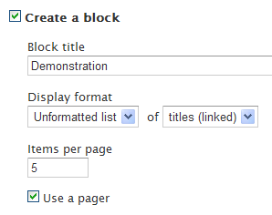
- Title: title of the display i.e. Title: Demonstration
- Format: the way the list displays. Display options out of the box are HTML List, Unformatted, Table. Settings vary based on the format chosen. i.e. Format: Unformatted list | Settings
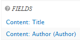
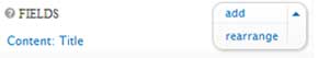
- Fields: list fields to display in your view i.e. Content: Title
- Filter: choose criteria to help limit the data that will display i.e. Content: Published (Yes) and Content: Type (= Book page)
- Sort criteria: indicates which fields to sort by and whether to sort ascending or descending. i.e. Content: Title (asc) will sort alphabetically.
- Access: limit who can see the view by role or permissions.
- Header: add text at the top of the list.
- Footer: add text at the bottom of the list.
- Pager: create a pager and indicate the number of items you want to display. i.e. Use pager: Full | Paged, 10 items More link: No
Advanced
- Contextual filters - dynamic filters to pass as arguments.
- Relationship - create links between 2 or more Entities and/or Content Types.
View Pointers
Here are some key points that are helpful when creating Views:
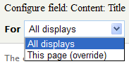 |
If you are changing the Display from the Master, you must choose the This page (override) from the top of the page. Otherwise, the Masterdisplay is changed. |
 |
Italics indicate the value has changed from the Master. |
 |
Add fields, filters, relationships etc. and rearrange the order of the list for that specific type. |
Settings - link next to the structure indicates additional configuration can be done.
Creating a View from Webform Data
The Webform is a great tool for many things, but it is not meant for displaying data on your website after it’s captured. There are some known limitations when trying to display data using Views with Webforms including the inability to use exposed filters and the sort feature for columns in a table. However, if you want a basic list without filtering and sorting capabilities, you can display the data in the following way:
Create the Webform View
- Creating a View of Webform submissions type, to display fields and set the pager as desired.

- Save by clicking on Continue & edit.
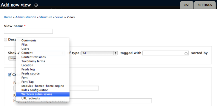
Adding Fields to the View
- Set Filter criteria to Title. Here you will put the title of the Webform; this will limit the display to data from a specific Weform.
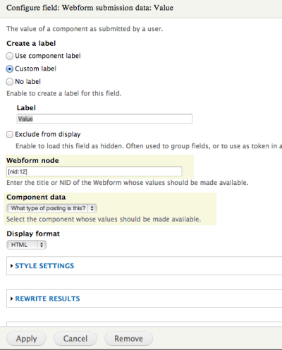
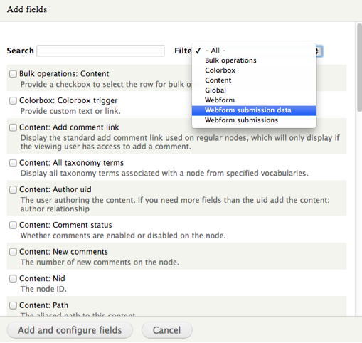
- Add fields of Webform submission data type.

- Click on the Webform submission data: Value checkbox and the configuration screen displays.
- Enter the Webform node ID on the Webform node field. (hover over the edit tab of the Webform to find the number).
- Once you add the node ID, the fields or components display below in the Component data field.
- Choose the field that you want to display, configure and click Apply.
-
Repeat this for each field you want to display. Configure the rest of the View according to other preferences.
Reusing Content Types and Views from Other Sites
If you are working on more than one site that have similar content structure, you can use the Bundle Copy module to export and import the code for the Content Types and Views. Once imported, you can adjust the Content Types and Views by adding fields and changing the display. Therefore, we recommend reviewing the basics for creating with Custom Content types.
Importing a Content Type
If you want to duplicate a Content Type or use a custom Content Type on more than one site, you can import the code with a simple copy and paste.
Enable the appropriate modules
- Select Modules > Bundle Copy
- Locate and enable the Bundle Copy Module in the Module listing.
Importing a Content Type
- Select Structure > Content Types > Export from the Administration toolbar.
- Locate the Content Type you want to export, in this example Rotating Header Image.
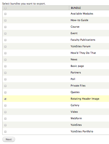
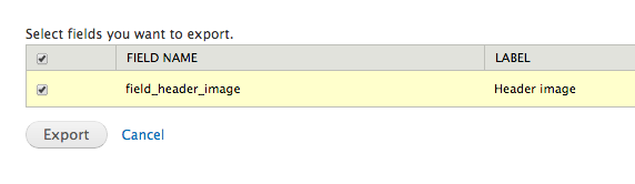
- The next dialog asks you to select the fields you want to export. Be sure to click on the top checkbox to get all the fields. This example has only one field, but for more complex Content Types there would be more fields.
- Click on Export and the following page with all the code that makes up the Content Type is listed.
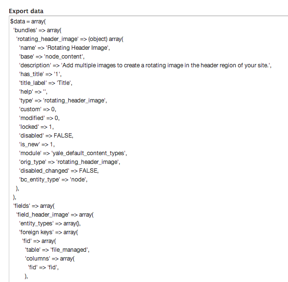
- Place your cursor in the text and select all the text; then copy to the clip board. Be sure not to add any spaces or other characters.
- Select Structure > Content Types > Import from the Administration toolbar.
- Change the name and paste the code in the fields as shown below
- Click on the Import button and the Content Type is created.
- Check your Content Type by clicking on Structure > Content Types > Name of Content Type
- Click on Comments to ensure they are turned off.
- Click on Display Settings and uncheck Display author and date information.
Export/Import a View
You can export a view and then import it to another site. The view is the first step to creating the list or display you want; once imported, the view will need to be adjusted according to the site specifications. For more information on working with views, we recommend you review the YaleSites Views tutorial.
Export the View
- Select Structure > Views > Export
- Locate the view you want to export, click on the Export button and copy the code like you did in the Content Type above.
Import the View
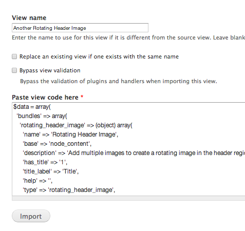
- Select Structure > Views > Import
- Locate the view you want to export, click on the Export button and copy the code like you did in the Content Type above.
- Paste the code in the field and click on the Import button.

Your page/block, etc is available for you to link or place on the site as desired.
Image Styles
One of the great features of Drupal is the ability to display an image in multiple sizes, without physically resizing the image, eliminating the need for multiple sizes of the same image on your server. This feature is called Image Styles and it allows you to define an image “preset” size which can then be chosen for display for a specific content type and/or view. To create an Image Style:
- Select Configuration > Media > Image Styles > Add style.
- Add the name of the Image Style (use lowercase, no spaces).
- Select Scale and Crop from the Effect section and click on Update Style.
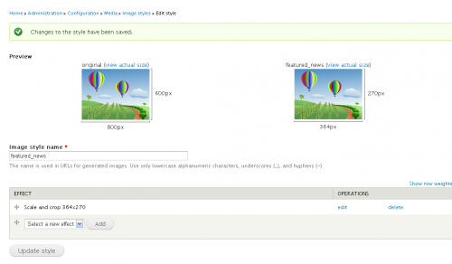
- You will be prompted to enter the height and width for the image style.

- Click Add effect and the Image Style is added to your list.
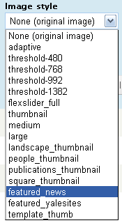
- Close out of that window, then go to a View or Content Type and you will see the Image Style listed as an option to change an image size to display.

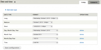
Creating a Date/Time format
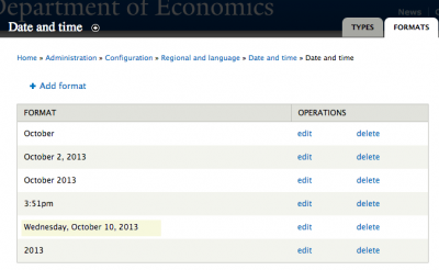
The Date and Time settings for your YaleSite come with many display options but might not display in the order or format that you want. You can add a new date format that will be available in the list of the standard date formats (Configuration > Date and Time formats > .
YaleSites comes with a variety of Date formats, but they are limiting. However, you can easily create a new date format in the following way:
- Select Configuration from the Toolbar then Regional and Language > Date and Time formats. The Date and Time page displays.
-
Click on the Formats tab and click on +Add format. The Formats dialog displays with the ability to configure and create custom formats.
-
Enter the PHP codes you using the PHP Manual link to indicate how you would like your date to be formatted.
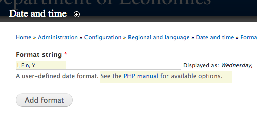
-
The PHP manual provides explicit instructions for which codes to use to get the desired result. For this example, I wanted the date to be set to month/day/year so I used the following codes: l, F n, Y where l is the full day spelled out, F is the full month, n is the day number without the leading zero, and Y is the 4 digit year. The new format displays when the configuration is saved.
Adding as a Type
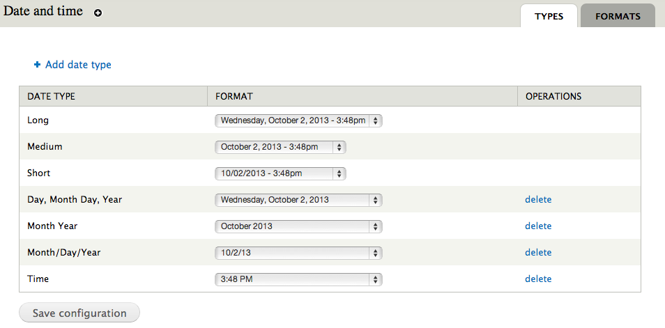
Once you have created your format, you have the option to name the format as a Date Type so that it shows up as an option on the date formats list in your Views or format options for Content Types.
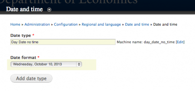
- Click on Add Date Type.
- Create a name (Date type) and choose your newly created date format (Date Format).
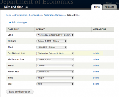
- The new format displays in the list:

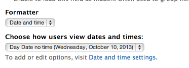
Assigning the date format to the View or Content Type
Once the date has been created it will be available in the list for views and/or content types. Just click on the drop-down menu (in this case a view) and select it as an option. You can also use it for any of the standard formats including Long, Medium and Short.
View
Choosing a date and time format for a View
Content Type
Choosing a date and time format for a Content Type:
YaleSites Secure Feature
YaleSites Secure is a Feature that offers additional security for sites that store or collect sensitive data for research projects or collecting information for study participants. YaleSites Secure has all the features that are included in a standard YaleSite with the following differences:
- Security (SSL) - Provides a secure version of the http protocol (https). Data is encrypted between client and server.
- Field Encryption - Provides the ability to select which fields can be concealed from unwanted sources using encryption.
- Native user login - Together with SSL allows the creation of secure accounts for study participants.
- Search Indexing Prevention - Site is not indexed by search engines, content would not appear as part of Google, Yahoo, etc.
Data that should NOT be stored
The following is a list of the types information that should NOT be included in your site.
- No user identifiable data including email addresses
- De-identification Fields are listed in Exhibit 5039 - EX.A
- Further information can be found under HIPAA Procedure 5039 - PR.1
Before you develop your secure website
The following is a list of important points that require consideration before developing your site with YaleSites Secure.
Prior to any development:
- All sites must through a preliminary Security Design Review (SDR) with the Yale Information Security Office (ISO).
- You must participate in YaleSites secure onboarding* to ensure the process is understood
Going Live:
- Once your site has been built, a final Security Design Review (SDR) scan will be performed to validate URLs and site security.
- Any SDR Scan issues found in the final scan must be fixed and approved before the site can go live. Sites will not be moved to production until the final SDR scan is fully approved and issues have been resolved.
- Resolving/approving these changes may take 2-4 weeks. Please plan your site warranty based on the approval date of the final SDR scan rather than the day development is completed. The warranty period should begin after website is in production.
Requesting YaleSites Secure Site
- Complete the Request a YaleSite form.
- Click on the checkbox to indicate you want YaleSites Secure.
- Request a Security Design Review (SDR) with the Yale Information Security Office (ISO).
- Participate in onboarding* meeting setup by YaleSites Web Team and ISO.
*YaleSites Secure Onboarding
In order to ensure the policies and process required for YaleSites Secure are understood, the vendor and site owner must attend a preliminary onboarding meeting. During this meeting the YaleSites Web Team and Yale Information Security Office (ISO) will provide you with the requirements necessary to build a YaleSites Secure site. Development on the site cannot take place prior to the onboarding meeting.
Important Note: The request and approval process for YaleSites Secure may take 2-4 weeks. Please plan accordingly.
Site URLs
YaleSites are provisioned in the development stage (.dev) unless otherwise requested.
- Development: https://site_name.dev.ys.yale.edu
- Production: https://site_name.ys.yale.edu
- If someone types in http://site_name.yale.edu, they will be redirected to https://site_name.ys.yale.edu
Website Access
Access to the site is determined by role a person has in development, participation and/or viewing the content. Important Note: Anyone who has access to the information on a YaleSites Secure site must complete HIPAA Privacy and HIPAA Security training on Yale’s Training Management System (TMS).
Site Building and Maintenance
- Administrators, Site Builders and Site Editor roles have access to administrative pages for the purpose of building functionality and maintaining the site content.
- VPN is required to access administrative pages when working on the site on or off-campus.
- Administrators, Site Builders and Site Editor roles must login using CAS (append cas to the end of their URL https://site_name.dev.ys.yale.edu/cas)
Participants
A participant is identified as someone who has access to the site to contribute to the study or research program, but does not have permission to access the administrative pages. Participants are given access to the site using native Drupal login.
- Direct participants to https://site_name.ys.yale.edu/user where they will be asked to login or create an account. Please use the following guidelines:
- Login accounts and passwords may not be user identifiable and may not be email addresses
- Users should not be able to receive email with their login / password
- Users should not be able to request passwords (module NoReqNewPass installed and configured)
- All login and passwords provided must be at least 8-14 characters as per Yale Compliance Requirements
- Third Party Authentication (HybridAuth) is NOT supported.
Participants who are logged in a given the default role of authenticated user. Additional Roles can be assigned to participants as dictated by site requirements.
Important Note: Email notification for new accounts must be setup to change the language to meet program/project needs.
Site Visitors
Anonymous users will only be able to view public pages of the site as determine by the root directory.
Page URLs and Site Structure
YaleSites Secure is setup to allow participants, anonymous users or site visitors to view pages that are in the public virtual directory. In order to create the virtual public directory, you must create a URL alias for each Content Types of any pages that will be viewed by the public (public/[node:title]). All pages that are available to anonymous users or people who are just visiting the site are stored in the public virtual directory.
- https://site_name.ys.yale.edu (index page)
-
https://site_name.ys.yale.edu/public/page-url
Restricted Access
Configuration and administration pages are restricted to Administrator, Site Builder and Site Editor roles. The following URLs are helpful for administrators to determine the path necessary when coding advanced template files and modules to ensure the path is correct.
/sites/default/files/* (images, pdf, other digital assets)
/sites/all/modules/* (modules used by the website)
/sites/all/themes/* (js, css used by the website)
/user/* (user profile details available only to authenticated user)
/flag/* (allowing for bookmarks using flag module)
/sites/all/libraries/* ()
/cas (allowing users to login with Yale CAS)
Security Standards
Digital Assets
All digital assets (images, pdf, etc.) cannot contain user identifiable information, examples include:
- PDF documents with contact information or personal information
- Images with text containing personal or contact information
Secure Login - Username and Password Creation
- Login accounts and passwords may not be user identifiable and may not be email addresses
- Users should not be able to receive email with their login / password
- Users should not be able to request passwords (module NoReqNewPass installed and configured)
- All login and passwords provided must be at least 8-14 characters as per Yale Compliance Requirements
- Third Party Authentication (HybridAuth) is NOT supported.
Prevent Search Engine Indexing
- This feature contains a robots.txt file with following content to prevent search engines indexing pages.
User-agent: *
Disallow: /