Views Accordion module allows you to create an expandable/ collapsible list - to show and hide information as needed. For example, you can show only the headers or teaser information for a specific type of content and display the full content by clicking on the header. The Views Accordion module provides an interactive dimension to your site, displaying only what is necessary to the page visitor.
The Views Accordion module uses the JQuery accordion to create the expandable/collapsible effect. Once it has been enabled as a Style option in the Views interface, it can be configured to display based on style preferences.
1) Enable necessary modules
Modules - locate the Views Accordion module in the Views section, click on the check box, then scroll to the bottom of the modules page and click on the Save configuration button.
2) Create View and enable the Views Accordion style
Since the Views Accordion module is a style option for a view display. once created you need to select Views Accordion when creating the View.
- Structure -> Views -> Add new View
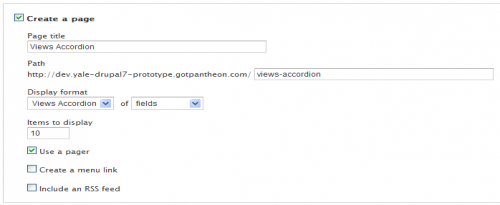
- Select Views Accordion under Create a Page -> Display Format (Views Accordion does not show up unless you have enabled the module).
- Configure items to display, pager and menu settings as desired.
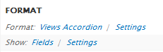
- Click Continue and Edit to add fields and adjust the configuration of the View. The Format section should look like this (Row style must be set to fields):
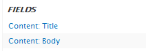
- Add fields to your view. At least 2 Fields are required as they are necessary to configure the Accordion.
3) Configure Accordion
You can configure the Accordion to group lists and set transitions for various effects.
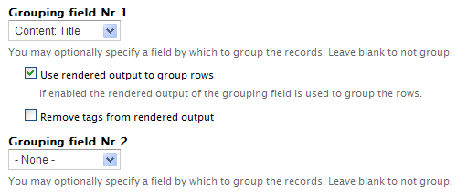
Grouping Fields
Grouping fields determines which fields expand to expose the rest of the content. The first field in your field list will be used as the “trigger” to expand the content UNLESS you choose the Grouping field. If you have multiple fields, you have the option to select 2 Grouping fields.
Additional configurations
- Row to display opened on start - Choose which record you want to have open when the page loads. None is the last option on the list.
- Animation effect - choose how you would like the transition when clicking on the accordion header.
- Event - if you want the transition to occur when the header is Clicked or Moused over.
Important Notes:
It is recommended you use the “module’s default styling” and then add a modified Views Accordian.css using CSS Injector.