Creating Custom Content Types and Fields
Different types of content have different meanings. Content Types allow you to define the content on your site using fields to capture pieces of information independently of one another. Each Content Type is treated differently; different properties, fields, page displays, etc. With Content Types, you can arrange what and how you want your content to be displayed as well as control who manages and creates that type of content.
Your YaleSite has built-in features that provide Content Types to make it easier for you to create, update and display your information about your department or organization. In addition to creating basic pages with the Basic Page Content Type, you can create the following types of content providing the features are enabled on your site:
- Basic page
- Event
- News
- Private Files
- Rotating Header Image
- Slideshow
- Video
Adding Fields to your Content Type
Fields allow you to capture small pieces of information, providing more control and flexibility in the display of content. Using Fields allows you to treat small pieces of content as an individual entity so that it can be listed in a specific order or formatted differently from the other text. For example, if you wanted to capture the phone number of staff members, you can control how the format of the number (###) ###-####, make it bold, and list it below the staff members name.
To define a field, you must consider the following:
- Name of the field
- Type of data the field will store
- How the data will be input and displayed
- How many values the field will store
Field Types
|
When adding fields you will select field type and configure as directed |
Select Widget |
|
Boolean (on/off) |
|
|
Date |
|
|
Email – displays clickable email |
|
| Entity Reference – connect to other content types/user profiles |
|
| File – upload files, pdf, doc, xls etc |
|
| Integer - for numbering and sorting |
|
| Image – upload images |
|
| Link |
|
| Text |
|
| List (text) - radio buttons or check lists |
|
| Long Text – multiple rows |
|
| Long Text and Summary |
|
| Term Reference - referenced from taxonomy list |
|
| Video Embed |
|
Additional Field Types Modules
In addition to the standard fields that are available, the following modules provide more field types that give your more control over the types of content that is entered and how that content displays on the landing page.
- Email Fields - The Email module turns your text field into a clickable email field without additional configuration on the landing page. Read more about the Email Field
- Entity Reference - The Entity Reference Module allows you to create a link to other content types such as a courses or profile page. Read more about the Entity Reference Module
- Link - The Link Module allows you to create a Link field type that, when displayed, shows a clickable link. Read more about the Link Module
- Video Embed - Creates a simple field that allows you to embed 3rd party videos (Vimeo and Youtube). Read more about the Video Embed Module
Useful Modules for Creating Custom Content Types
The following Modules, while not necessary, are commonly used when creating Custom Content Types.
Automatic Nodetitles - Automatic Node Titles allows you to create custom title fields with the use of tokens so you can combine the first name and last name as the title field. Read more about the Automatic Nodetitle Module
Field as Block - This handy little module allows you to take a field and turn it into a Block that you can display in various field. A great way to simplify putting related content in the various regions of your site. Read more about Field as Block Module
External Links - External Links adds icons at the end of your links to indicate if the links point to an external site or is an email link. Read more about the External Links Module
Field Permissions - The Field Permissions module allows administrators to control who sees fields for your content types. For example, you might have a Content Type that captures an email address for the requestor, but you don’t want that information available to all people who view the site. Read more about the Field Permissions Module
Field Redirection - Redirects any field formatter for Link, Term Reference and Entity Reference fields that open a web page or URL. This module automatically redirects a page/node to the URL in the field entered. If no URL is entered in the field, the page/node is opened. A field settings widget is provided to allow selection of the appropriate HTTP status code. Read more about the Field Redirection Module
Fieldgroup - Allows you to create a group for fields created in your content type. Once enabled, the fieldgroup is created as a field and format to display is chosen. Then various fields that are part of that fieldgroup are added via drag-and-drop. Read more about the Fieldgroup Module
Working with Various Field Types
Title field – title of the page, regardless of the content type. The red asterisk * indicates a required field. Important Note: some Content Types have changed the label for the title field to a more appropriate label.

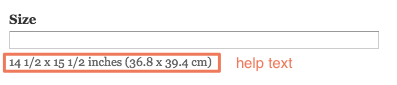
Text field – like the Title field, the Text field allows you to add limited text, but is not necessarily required. When special instructions are required, help text help text displays below the field.
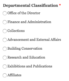
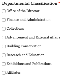
Text List field – allows you to select from a list of options. These options can be check boxes, radio buttons or a select list.
- Select List initial field:
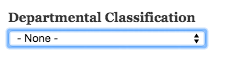
- Click on the arrows and the list displays

- Hover over and click on one of the options and it displays in the field:

Radio Buttons – if a select list displays radio buttons, only one option can be selected.
Check Boxes – if a select list displays check boxes, more than one option can be selected.
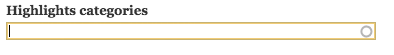
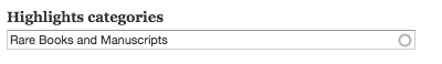
Autocomplete field – options are associated with a list of terms – taxonomy or other text list – allows you to locate the term by typing in a few letters of the word. Options can be chosen from the list that displays as the letters are entered. You can tell that it’s an autocomplete field by the circle that displays at the end of the within the field itself.
- Initial field:
- Enter letters and the list displays.
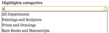
- Hover over and click on one of the options and it displays in the field:
Date/Time field – used to add dates for publications and events. Incorporates a calendar widget to facilitate picking the date and ensure the date format is correct.
- Initial field displays the current date:
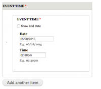
- Click on the Date field and the calendar widget pops up - click on the date:
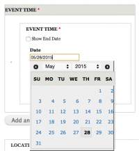
- Enter the time manually; be sure to include the AM, PM.
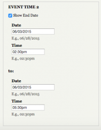
- If you want to display an end date/time for the event, click on the Show End Date check box and fill in the date/time.
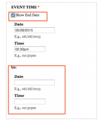
- If you want to add multiple dates for an event that has the same name, click on Add Another and add the date/time for the next instance. You can add as many as you like.
Image field – Used to upload an image related to the content. The image field has 2 buttons – the 1st to choose the image, the 2nd to upload the image to the server.
- Locate the image field and click on Choose File. This will bring you to the file manager.

- Locate the image using the file manager and double-click on it.
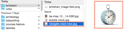
- The image displays next to Choose File, but it’s not uploaded yet.

- Click on the Upload button to upload the image to the server.
- Add Alternate text to meet accessibility standards so the image can be “seen” by screen readers and search engines.
- Add Title text to be used as tooltip text and a caption for the image.

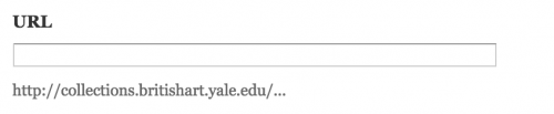
Link field – Used to add a link that is clickable. Link fields have the option to have a custom label or not. If there are 2 text fields to enter, the first field is the Title or label for the link – the text that will display as a link when done. The second text field is for the full URL which MUST include http:// or https://
- Enter the label text in the Title field and the full URL in the URL field.

- Here is a URL with no label and help text to provide guidance and a reminder of how the text should be formatted.
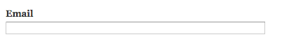
Email field – These fields are usually found in People listings where the email for the associated person is added. Even though the field looks like a text field, when used, the text displays as a clickable link on the landing page.
- Enter the email address in the email field.
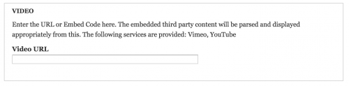
Video field – Used to display video from 3rd party services YouTube and Vimeo. Adding the share URL from either of these services display a play in place video.
- Enter the share URL from Vimeo or YouTube in the Video URL field.
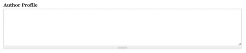
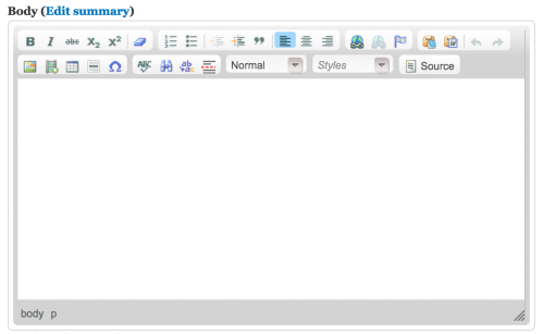
Long Text – Used to add multiple paragraphs of text with no limits. Some Long Text fields have the WYSIWYG toolbar which allows you to format text with limited options.
- Long text with WYSIWYG toolbar
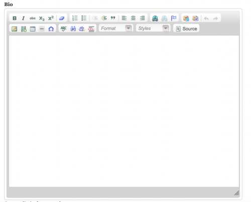
- Long text without WYSIWYG toolbar
Long Text with Summary – allows you to separate the text into 2 independent sections. This is useful when the initial text of this field requires editorial oversight so the text fits within a smaller section or teaser (see http://news.yale.edu home page).
File field – used to upload a PDF, MS Word or other type of document to the site – DOES NOT INCLUDE IMAGES. Like the Image field, the files are uploaded to the website in 3 steps.
- Click on Choose File in the image field. This will bring you to the file manager.

- Locate the file that you want to upload. Be sure the file type is allowed (see help text that indicates allowed file types).
- Click on Upload. The file is uploaded to the website and displays on the landing page.